Monday, May 23, 2011

Sunday, May 15, 2011

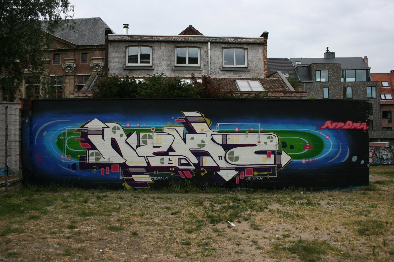
New 2


"Keef, that was a good run through, but can we do the solo again to sound a little... um... Lady Gaga or something, and maybe the vocals should be done with Auto-Tune."  Keef: "Faaark Orrrf!"
Sorry, had to digress. I did a full outline on paper for once. One of my fonts x the current thread I'm steadily exploring. Just got a bit of paint again, looking forward to a few days in a row free to use some...

Wednesday, May 4, 2011

Double Dutch


A buddy spotted this in a paper...

Ephameron in Coney Island

Belgian illustrative artist Ephameron features in this vid. Nice to see some spray paint used minus the bombast. Quiet and direct.

Monday, May 2, 2011

New x Two


Two days in a row not knowing what to paint. The first afternoon I did a simple fun thing. My initial photo was taken in poor light, so I went back the next morning, and winged another piece while I was there.
Having 'nothing', so to speak, made me rely on my past (which is a way too common practice for me). I remembered something I wrote next to a piece as a teen, "go about your own thing, fuck competition and being a king". Ok, it's teenish, but 20+ years on it has become a more important notion than ever, as keeping up with the Jones's, fa fa fa fashion in writing and self promotion plays too vital a role. Give me writers with a personal set of images / symbols and their empirical studies that I can follow. Then I have the means to critique without the haze. Anyway...

Monday, April 25, 2011

NYC

Thanks Dmote!!!!


New, Daze, Kaves, Shank, Boi, BG, Nicer, Samp, Rae, Yes2

Knows, SP-ONE, Enue, New, Shank, Rae

NYC


NYC


Sunday, April 24, 2011

Sunday, April 3, 2011

The Benelux Writers Convention


About 100 writers from the Benelux region got together for a jam on Saturday. Perfect weather and a really good grassroots event. I finished as the sun went down and managed to grab a beer at the bar and a few quick shots of a small portion of the walls done.

For my part, I freestyled this with whatever paint I could scrape up, and luckily had enough of a color range in my bag to get away with it. A friend and I where discussing approach to style, technique, what to put into a piece or more importantly, what to leave out. He broke out a musical analogy, (which I'm always down for). If his painting technique was akin to Pavement's musicianship, mine was similar to Akron/Family. It's for one, a nice compliment, and secondly it's nice to know someone else sees in a similar way to yourself what you're attempting to do.

The Benelux Writers Convention


Eindhoven Trip Joiner - BYZ NEW CHESS


Some proper shots of our part of the wall, (thanks).
Unfortunately I haven't got flix of the rest of the wall, including Mister and Chas burners.
We painted fast and digressed a little from the 70's / psychedelic theme. My E was a nod to old psychedelic poster art, and the pink fill in it is the chemical diagram for acid.
RIP Stanley Owsley III

Monday, March 28, 2011

New Jush... in Holland again...


A days painting with the Jush. A weekend of fast pieces. Banged out about half a dozen lately that aren't going to appear here. Looking forward to getting into a slow and considered wall again.

Friday, March 25, 2011

Parallels

I often think about writing's ability as an art form to be as expressive, human and as profound as other art forms demand to be treated. I also ask myself a few questions regarding writer's abstraction of letter based graffiti to reach a larger audience, development both creatively and career wise versus deeper exploration of letterform and making a stand for our art form in the gallery space. But, hey, I'm not going to bore you with that.....Instead...


I found a little section from Jean-Pierre Criqui and from Roland Barthes in 1973, The Responsibility of Forms, that partially covers some ground for me...


Psychedelic (feel free to insert the word graffiti) design, which sometimes verged on a kind of cryptology, was of course dependent on establishing an identity that immediately distanced itself from prevailing social and cultural codes: the poster for an event or happening couldn't easily be deciphered by any old square, and from the outset was designed to appeal to a specific community. But, beyond this rejection of the principles of mass marketing, a new reappraisal of the modern concept of the arts and of the conventional relationship between text and image was taking shape.


Roland Barthes in his discussion of an anthropomorphic alphabet designed by Erté:

'Graphic (again, feel free to insert graffiti instead) art, if we can shake off our society's empiricist yoke, which reduces language to a simple instrument of communication, should be the major art which transcends the futile opposition of figurative and of abstract: for a letter, at one and the same time, means and means nothing, imitates nothing and yet symbolizes, dismisses both the alibi of realism and that of aestheticism.'


Tuesday, March 8, 2011

New

Quarks v. 1.0